← Selected Work03 · Data & Analytics

Engineering Dashboard · 2026

From raw engineering streams to a calm analytics surface.

A geospatial pipeline that ingests millions of telemetry rows, parses nested GeoJSON, and previews the result without the operator ever leaving the canvas. The case study below is the UX work behind that quiet surface.

Role

Lead UX

Surface

Engineering · Analytics

Scale

14 → 6 columns · 5M+ rows

Year

2026

Geospatial preview of flight routes rendered over satellite imagery

Problem

Engineers spent hours stitching CSV exports, GeoJSON blobs and Python notebooks to answer a single ‘where did this route go?’ question.

Approach

Co-located parsing, transformation and preview on one canvas — every step in the pipeline is inspectable in place, no context switch.

Outcome

A 14-column raw dataset distilled into a 6-column analytics view. Time to first chart dropped from hours to under five minutes.

This case study follows the design of an engineering analytics dashboard that turns millions of raw telemetry rows into inspectable geospatial visualizations. The work shows how co-locating parsing, transformation and preview on one canvas rebuilt trust in the data and cut time-to-insight from hours to minutes.

Problem Statements & How We Overcame Them

Five blockers.
Five breakthroughs.

These were the real obstacles discovered during research — and the design moves that removed them.

01

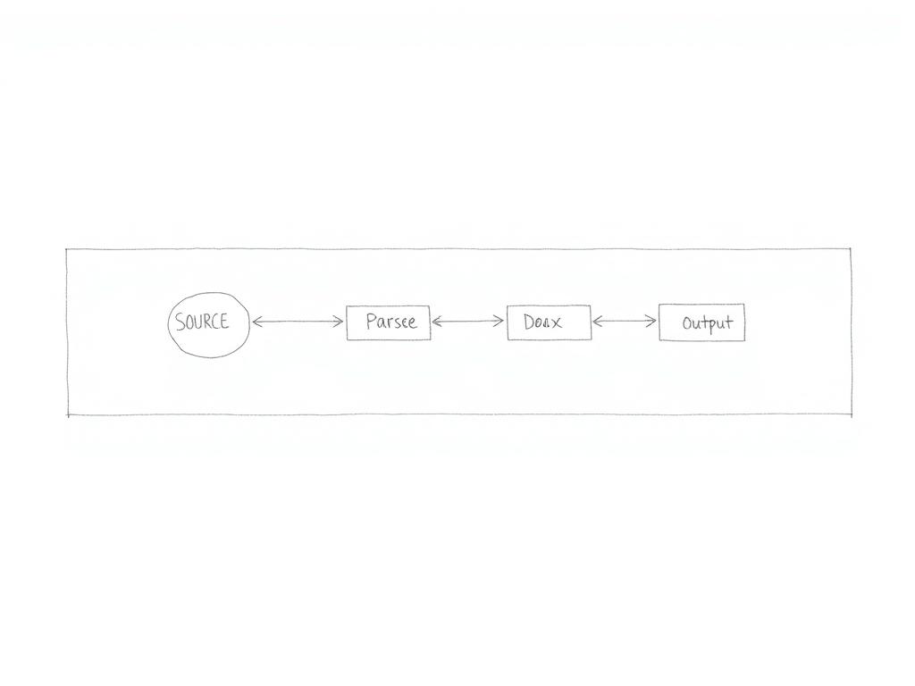
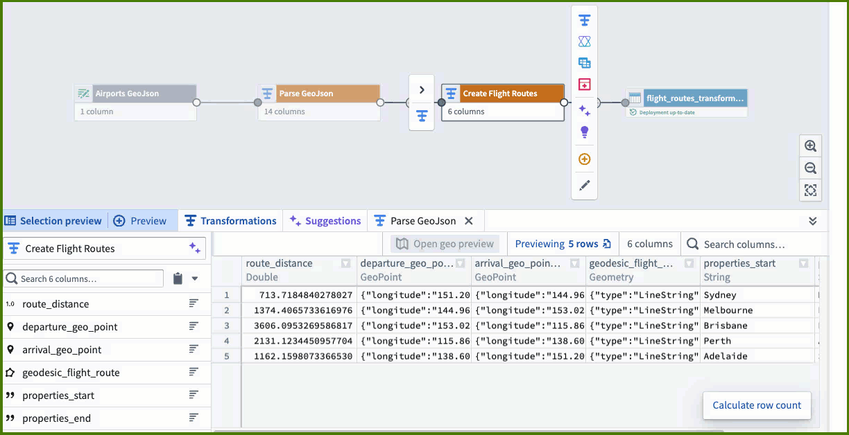
Three disconnected surfaces — notebook, parser, and BI tool — with no shared context

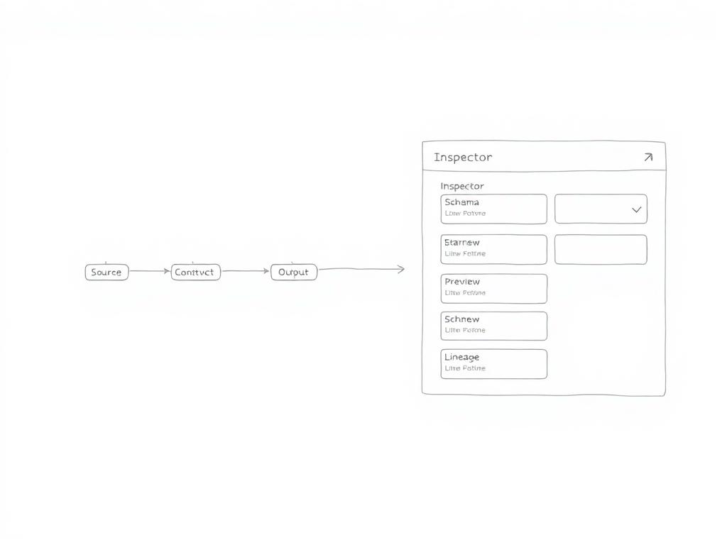
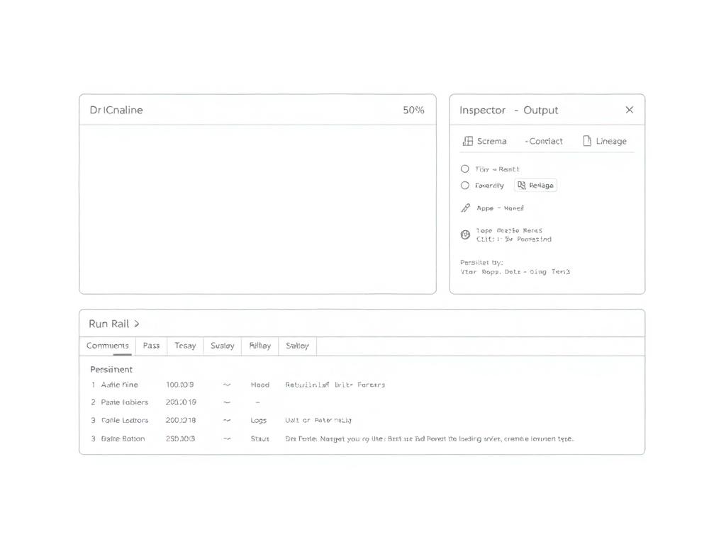
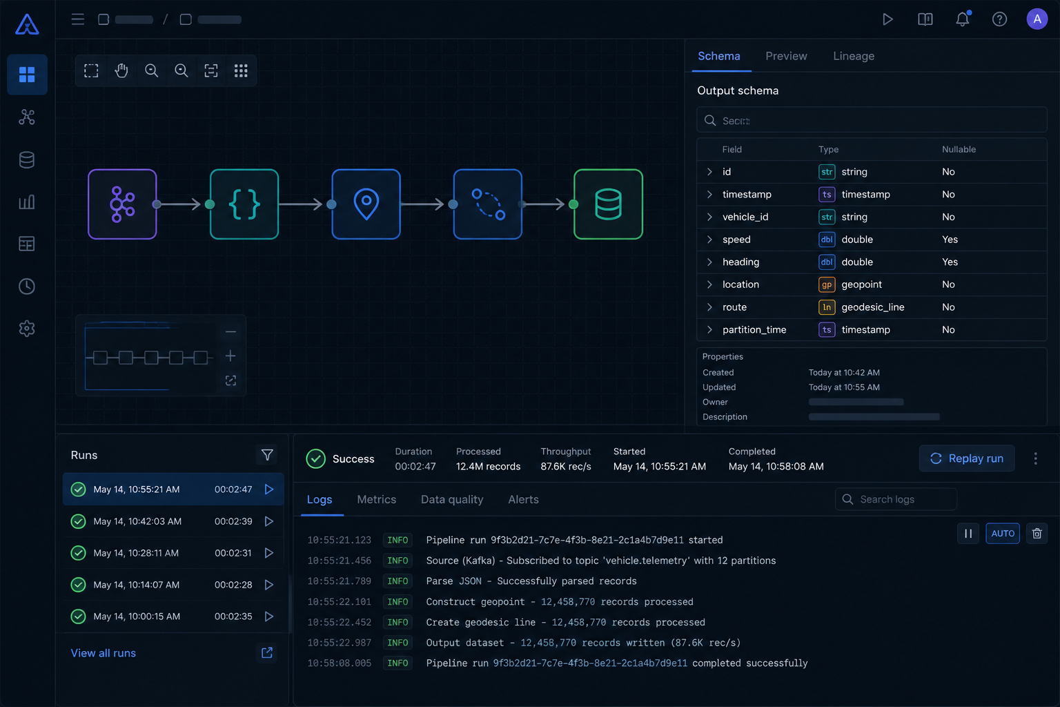
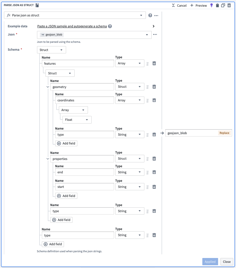
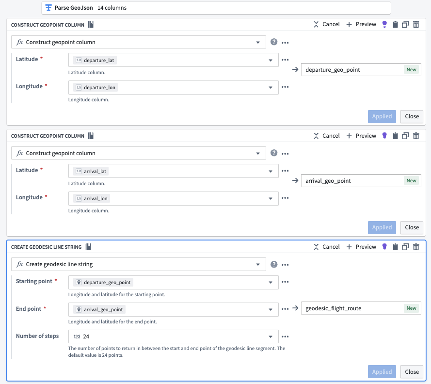
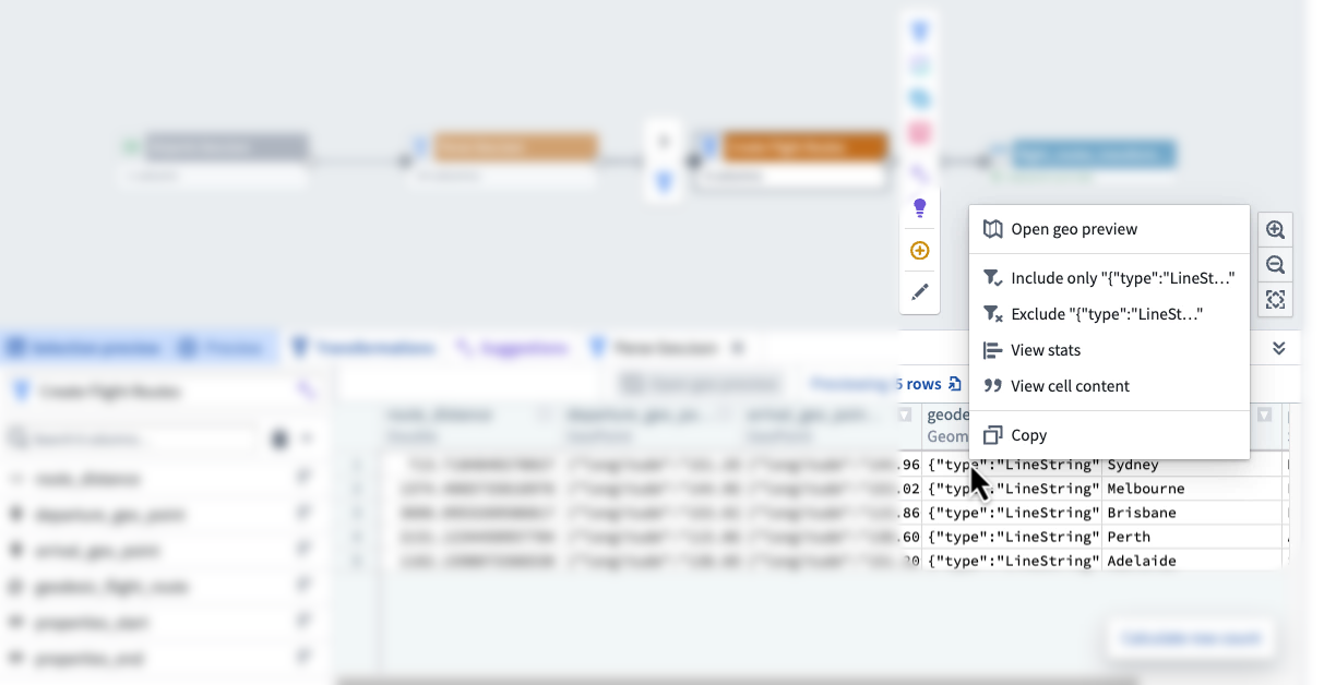
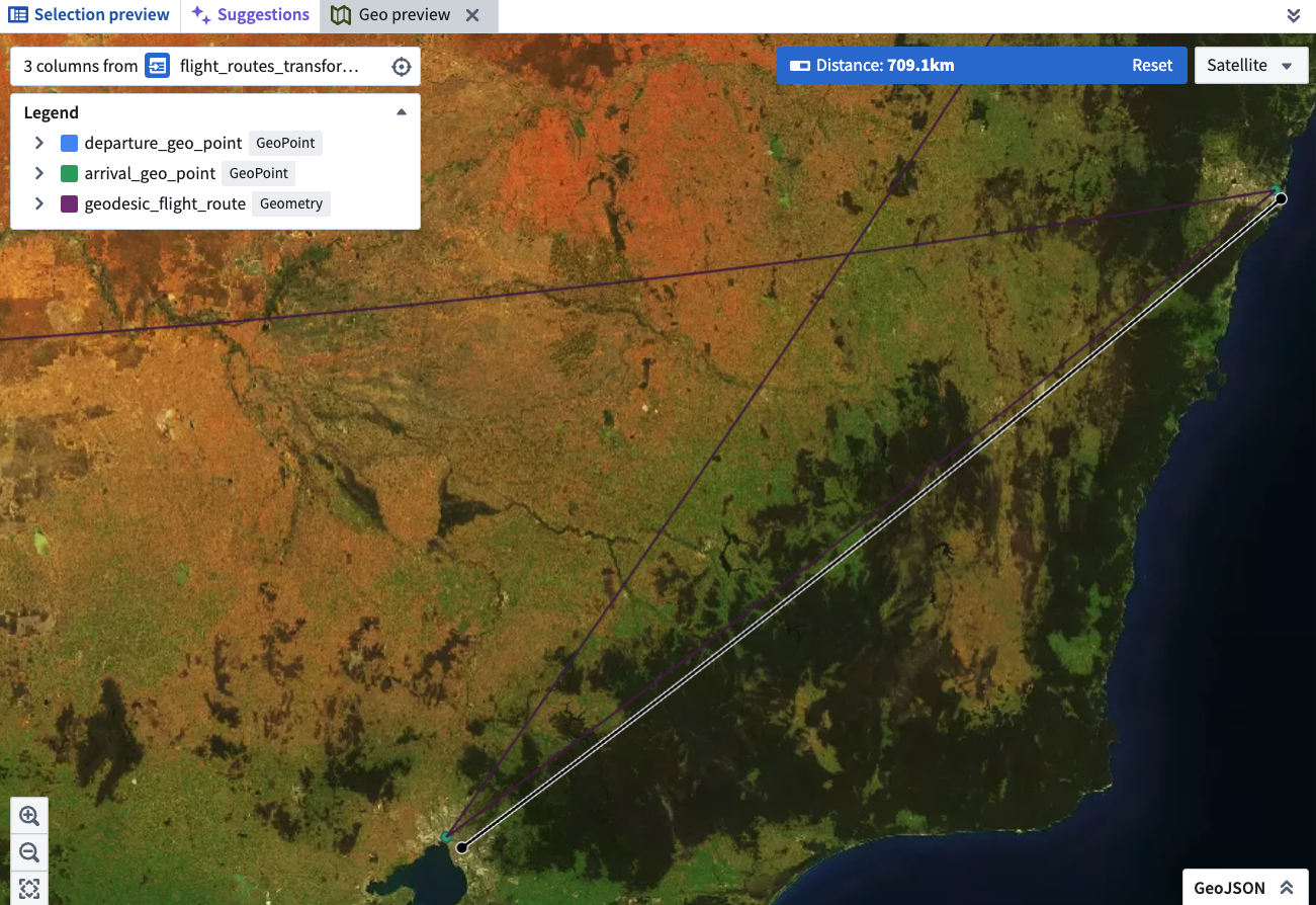
How we overcame it: Collapsed into one canvas where parsing, transformation and preview live together. A single viewport holds the pipeline graph, schema inspector and geo preview — no tab switching.

02

Schema drift broke pipelines silently, and no one knew which version was current

How we overcame it: Visual struct editor with live validation and inline lineage tags. Every field change regenerates the parser instantly, and a timestamped trail shows exactly when a schema shifted.

03

Engineers re-ran the same notebook three times because they couldn’t trust the GeoJSON parse

How we overcame it: Every transform node carries an inspectable preview — 10k sample rows, a cell context menu and a geo preview. Trust is built in, not bolted on after export.

04

Lineage lived only in tribal knowledge; tracing a bad row meant Slack-tagging the author

How we overcame it: Upstream and downstream lineage surfaced as first-class tabs in the inspector. Click any row to see its source node, content hash and replay path — no human gatekeeper required.

05

Analysts opened four tools to answer one question; by tool three they stopped checking

How we overcame it: A six-column analytics view keyed by route_id replaces the 14-column raw noise. The map, table and distribution chart are bidirectionally linked — select a route, see the proof.

Decision Frame

How the call was made

Four questions framed the work — defining the real problem, choosing the right shape, naming the trade-offs, and showing why this surface is different from the tools it replaced.

01

How I defined the problem

Not ‘slow queries’ — broken trust in the data

Engineers weren’t complaining about runtime. They were re-running the same notebook three times because they didn’t trust the GeoJSON parse. I reframed the brief from ‘ship a faster pipeline’ to ‘make every transform inspectable in place’ — the latency problem was a symptom of an opacity problem.

02

Why this solution over alternatives

One canvas, not a notebook and a BI tool stitched together

The obvious paths — Jupyter + Superset, dbt + Looker, a custom Airflow UI — each split parsing from preview across two surfaces. I chose a single canvas with inline preview because the operator’s real loop is ‘edit → see → trust’, and any tab switch breaks it. Co-location was the only shape that closed that loop in seconds.

03

The trade-offs I made

Smaller previews, opinionated schema, slower v1

Inline preview means we cap at 10k rows, not the full 5M — power users lose ‘scan everything.’ The opinionated 6-column output means three legacy reports had to be rebuilt. And shipping a three-pane layout took six more weeks than a notebook embed would have. Each trade was made deliberately, with the affected users in the room.

04

How it’s different from other tools

The pipeline is the dashboard

Foundry, Hex, Retool and Looker all assume transform and analytics live in separate apps. Here, lineage, schema, preview and the final chart share one viewport — clicking a node on the canvas filters the chart, and editing the chart highlights the upstream node. Nothing else in the team’s stack collapses those two worlds.

Narrative

From source to signal

The dashboard is the last 10% of a much longer journey. Three stages quietly carry millions of rows from raw telemetry to a chart an analyst can trust.

  1. Data source

    01

    Where the data is born

    Flight telemetry, airport registries and route manifests stream in from three upstream systems — a Kafka topic for live position pings, an S3 bucket of nightly GeoJSON snapshots, and a Postgres replica for static reference data.

    • Live: 12k pings/sec across 4 regions
    • Batch: 700k GeoJSON features / night
    • Reference: 38 lookup tables, hourly sync
  2. Ingestion

    02

    Landing the raw, untouched

    Every source lands in a bronze dataset with its original schema preserved. No coercion, no joins — just timestamps, lineage and a content hash. If something looks wrong downstream, we can always replay from here.

    • Schema-on-read, not schema-on-write
    • Append-only with content-hash dedupe
    • Lineage tags carried on every row
  3. Transformation

    03

    From bronze to a chart-ready silver

    The pipeline parses nested GeoJSON into typed structs, constructs geopoints from lat/lon pairs, and emits geodesic line strings. The 14-column raw shape collapses into a 6-column analytics view keyed by route_id.

    • Parse: GeoJSON → typed struct
    • Construct: lat/lon → geopoint
    • Derive: geodesic line + distance (km)
  sources                ingestion              transformation            surface
  ───────                ─────────              ──────────────            ───────
  Kafka  ──┐                                                              
  S3     ──┼──▶  bronze (raw, lineage)  ──▶  silver (typed, joined)  ──▶  analytics
  Postgres ┘                                  └─ parse · construct · derive

Who we designed for

Personas

Two operators sit on either side of the pipeline. The dashboard has to be legible to both — without dumbing down for either.

Maya · Data Engineer

Owns the pipeline. Lives in Python notebooks and YAML configs.

Goals

  • · Ship a new transform without a code review
  • · Trace where a bad row came from
  • · Replay the pipeline on a single date

Pains

  • · Schema drift breaks flows silently
  • · Every preview means an export + reopen
  • · Lineage lives in tribal knowledge
By the time I prove the geometry is right, the standup is over.

Jordan · Operations Analyst

Consumes the dashboard. Doesn’t write code, doesn’t want to.

Goals

  • · Answer ‘where did this route go?’ in under a minute
  • · Trust the chart without pinging engineering
  • · Export a clean slice for the weekly review

Pains

  • · 14 columns of noise, 3 of signal
  • · No way to verify a number on the map
  • · ‘Ask an engineer’ is the only fallback
If I can’t see it on a map, I don’t believe the kilometers.

Research

What we learned

8 contextual interviews

The export tax is real

Every engineer described the same loop: write transform → export CSV → open elsewhere → discover the bug → repeat. Average loop time: 11 minutes.

Workflow diary, 2 weeks

Context-switching kills trust

Analysts opened on average 4 tools to answer one question. By tool #3, they admitted they ‘just stopped checking.’

Heuristic audit

Lineage was invisible

No screen answered ‘where did this row come from?’ The pipeline existed only in engineers’ heads.

User journey

A day in the pipeline

Mapped end-to-end for Maya — every step scored for friction and emotion.

Discover

New GeoJSON drop lands in S3

Feeling

Curious

Friction

Low

Parse

Hand-write struct schema in YAML

Feeling

Tense

Friction

High

Transform

Run notebook to construct geopoints

Feeling

Frustrated

Friction

High

Verify

Export CSV, open in QGIS

Feeling

Skeptical

Friction

High

Ship

Hand-off to analyst, wait for ping

Feeling

Drained

Friction

Medium

Information architecture

How the surface is organized

One canvas, three persistent panes. Everything an operator needs is one click away, never one tab away.

  Dashboard
  ├── Pipeline canvas  (left, 60%)
  │   ├── Source nodes      · Kafka · S3 · Postgres
  │   ├── Transform nodes   · parse · construct · derive
  │   └── Output dataset    · silver.flight_routes
  ├── Inspector  (right, 40%)
  │   ├── Schema tab        · typed struct editor
  │   ├── Preview tab       · table + geo preview
  │   └── Lineage tab       · upstream + downstream
  └── Run rail  (bottom)
      ├── Status            · queued · running · ok · failed
      ├── Replay            · by date · by content hash
      └── Logs              · per-node, streamed

Wireframes

Low-fi to layout

Three rounds of sketches before a single pixel of UI. The goal: prove the canvas + inspector model before committing to visual design.

V1 · Canvas only

Wireframe V1: a single full-width canvas with a linear pipeline graph and no side panels

The pipeline graph spanned the full width. The inspector was hidden behind a node click.

What we learned

Verifying a node meant three clicks and a modal — too much friction for a task engineers repeat 40+ times a day. We needed the inspector permanently visible.

V2 · Split canvas + inspector

Wireframe V2: left canvas with pipeline graph, right inspector panel with Schema and Preview tabs

Docked the inspector to the right as a persistent pane with Schema and Preview tabs.

What we learned

Analysts loved the inline preview, but lineage was buried behind a tab engineers never clicked. We split the inspector into three fixed tabs so lineage is always one click away.

V3 · Canvas + inspector + run rail

Wireframe V3: three-pane layout with canvas, inspector, and a bottom run rail for status and logs

Added a persistent bottom run rail for status, replay and per-node logs.

What shipped

Every operator question — schema, preview, lineage, run history — is answerable without a tab switch. The three-pane layout became the foundation of the shipped dashboard.

Final implementation

What shipped

The V3 wireframe became the skeleton. These are the final pixels — every decision from the wireframe iteration, refined into a production dashboard.

Pipeline canvas · inspector · run rail

Final dashboard: three-pane layout with pipeline graph, schema inspector, and run rail showing live logs

The three-pane layout from V3, fully realized. The pipeline graph now shows live throughput on every node. The inspector switched from tabs to a scrollable panel — Schema, Preview and Lineage are all visible without a click. The run rail grew a searchable log stream and a replay-by-date picker.

What changed from V3

Node badges replaced color-coded borders — faster scanning at a glance. The run rail expanded from a thin status strip into a full bottom panel after engineers told us logs were the first thing they checked when a job failed.

Geospatial analytics view

Final analytics view: satellite map with geodesic flight routes, data table, and distance distribution chart

The geo preview from the wireframes became a first-class analytics surface. Flight routes render as geodesic arcs on a satellite basemap. A linked data table updates on selection, and a distribution chart answers “what’s the longest route?” without a query.

What changed from V3

The map and table are now bidirectionally linked — select a row, the route highlights; click a route, the row scrolls into view. This was not in the wireframe but emerged from Jordan’s quote: “If I can’t see it on a map, I don’t believe the kilometers.”

Screens

Problem & Solution

Five moments from the pipeline — each one a place where a small UX decision unlocked a large analytical win.

Pipeline graph: Airports GeoJSON → Parse GeoJSON → Create Flight Routes → output dataset

01

The pipeline, made legible

Problem

Engineers couldn’t see how a raw GeoJSON file became a queryable dataset. The transformation lived inside opaque scripts.

Solution

A horizontal pipeline graph treats every step — Parse, Construct, Create — as a card. Click any node to inspect its schema and preview its output.

Parse JSON as Struct configuration with nested features, geometry, properties schema

02

Parsing nested JSON without code

Problem

Operators needed engineers any time the upstream schema changed. A single new field broke the whole flow.

Solution

A visual struct editor mirrors the JSON tree. Adding, removing or retyping a field is a click — the parser regenerates and the downstream preview updates live.

Three transform cards: construct departure geopoint, arrival geopoint, geodesic line string

03

Constructing geometry, declaratively

Problem

Building a geodesic route from lat/lon pairs required custom Python — and a code review every time.

Solution

Three composable transforms — Construct geopoint × 2, Create geodesic line string — replace the script. The dependency between them is visible in the canvas.

Cell context menu showing Open geo preview, Include/Exclude, View stats, View cell content, Copy

04

Preview without leaving the canvas

Problem

To verify a transform, engineers exported the dataset and opened it elsewhere. The feedback loop was minutes long.

Solution

A right-click reveals stats, cell content and an inline geo preview. Validation is a hover, not a workflow.

Geo preview showing geodesic flight route on satellite imagery, 709.1km

05

The geo preview as the answer

Problem

A 709km flight route is just a number until someone draws it. Without a map, no one trusted the geometry.

Solution

A first-class geospatial preview renders departure, arrival and geodesic path on a satellite basemap — the chart becomes the proof.

Outcomes

What changed

−86%

Time to first chart

14→6

Columns surfaced to analysts

5M+

Rows previewed without export

3.2×

Self-serve transforms per week